Microcement colour and texture: choose in your space.
A colour is never separate from the room. Daylight, kitchen cabinetry, timber and walls all take part. The same tone can feel different beside warm oak and cool natural stone.
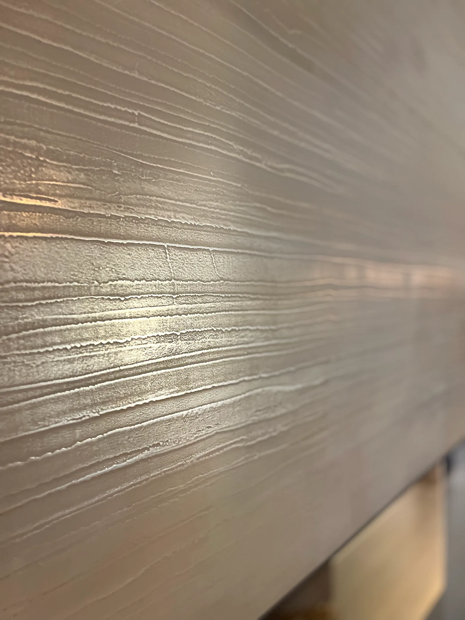
Microcement brings texture into that relationship. Grain, hand-applied movement and reflected light shape its character together. A considered choice therefore begins with a physical sample, viewed where the material will actually be used.
First the room, then the colour.
Should the floor quietly recede or become a more visible part of the interior? Are you seeking continuity with an existing material, or a deliberate contrast? Those questions give more direction than immediately comparing dozens of shades.
Start with the decisions already made: a cabinet front, table, basin stone or wall colour. Then choose a few tones to examine alongside them. Consider how the room is used too. A living room, daylight-filled shop and indirectly lit bathroom do not automatically call for the same finish.
Beige, grey or somewhere between?
Colour names are starting points, not complete descriptions. Two beige samples can differ substantially: one sandy, another leaning towards pink or yellow. Grey can feel cool, greenish or warm. Look at the undertone you experience beside the main colour.
Place samples directly against the materials that will remain in the room. A tone that feels right on its own can become too cool or pronounced in combination. A photograph of similar timber is less informative than the actual cabinet material.
| Direction | What to explore | What to check on the sample |
|---|---|---|
| Light and chalk-like | A quiet base with little emphasis on colour. | Relationship with white walls and marks under grazing light. |
| Sand and warm beige | Continuity with timber and warmer interiors. | Whether the undertone fits the actual wood and stone. |
| Warm grey or greige | A position between grey and beige. | Behaviour beside both warm and cool materials. |
| Cooler grey | Contrast with warmer elements or a restrained palette. | Whether the real room light gives the intended feeling. |
| Deeper and darker | More emphasis on the surface and spatial form. | Reflection, visible movement and protective finish. |
These are viewing directions, not a fixed colour collection. Available colours and finishes are discussed for the chosen system.
Texture does more than a photograph shows.
A relatively smooth surface carries a different character from one with a clearer grain. It is not only a tactile difference. Light reveals structure and can emphasise particular movements in the handwork.
Assess colour and texture together. A colour sample made in a different texture is not a complete representation of your eventual choice. Terms such as fine, coarse, smooth and polished also leave room for interpretation. Ask which product and finish the sample represents so you are discussing a specific surface.
Sheen is a separate choice.
Colour, texture and sheen connect, but are not the same. A fine grain does not establish how much light the surface reflects. A matte appearance does not mean a floor has no reflection in every lighting condition.
The final protection contributes to the overall result. Judge a sample with the intended finish rather than an unprotected colour layer alone. Do not infer technical performance from appearance: a coarse texture is not proof of the slip resistance needed for a shower, and matte does not mean that use can never leave a mark.
For a bathroom, appearance and appropriate execution belong in the same discussion. A floor and wall may share a colour direction while needing separate consideration of their use.
What light does to the surface.
Light coming from the side reveals marks differently from light falling directly onto the finish. A sample on a table under a lamp can therefore look different beside a window. View it at more than one time of day and include the lighting you use in the evening.
You do not need every possible light source. You need the light in which you will experience the room. Lay a floor sample horizontally; hold a wall sample vertically at the intended location. Look closely, then step back to an ordinary viewing distance.
Photographs guide; samples support a decision.
Project photographs show scale, furniture relationships and daylight. They are useful references because the material is part of a real space. They are not exact colour standards. Camera exposure, editing and your screen affect the image.
A digital colour code also cannot communicate handwork, grain and protection. Bring a paint or interior-colour reference if you have one. We can discuss what is possible in the selected system and assess the combination physically. Matching names or codes do not guarantee that two different materials will look identical.
Handwork with its own pattern.
Microcement is applied by hand, creating the movement that gives the surface its character. It is not a factory pattern repeated across a floor. A sample establishes colour, texture, sheen and the intended degree of movement; a large area is not a literal enlargement of that small piece.
Discuss how quiet or expressive you want the whole surface to feel. That does not make every difference acceptable by definition. The agreed direction remains the reference. Talking through the sample prevents 'handmade' from meaning something quite different to each person.
For projects with several decision-makers, record the selected sample and who approved it. If lighting, protection or a neighbouring material changes later, review whether the combination still gives the intended result. The guide to recording material choices provides a practical structure.
Look at completed spaces.
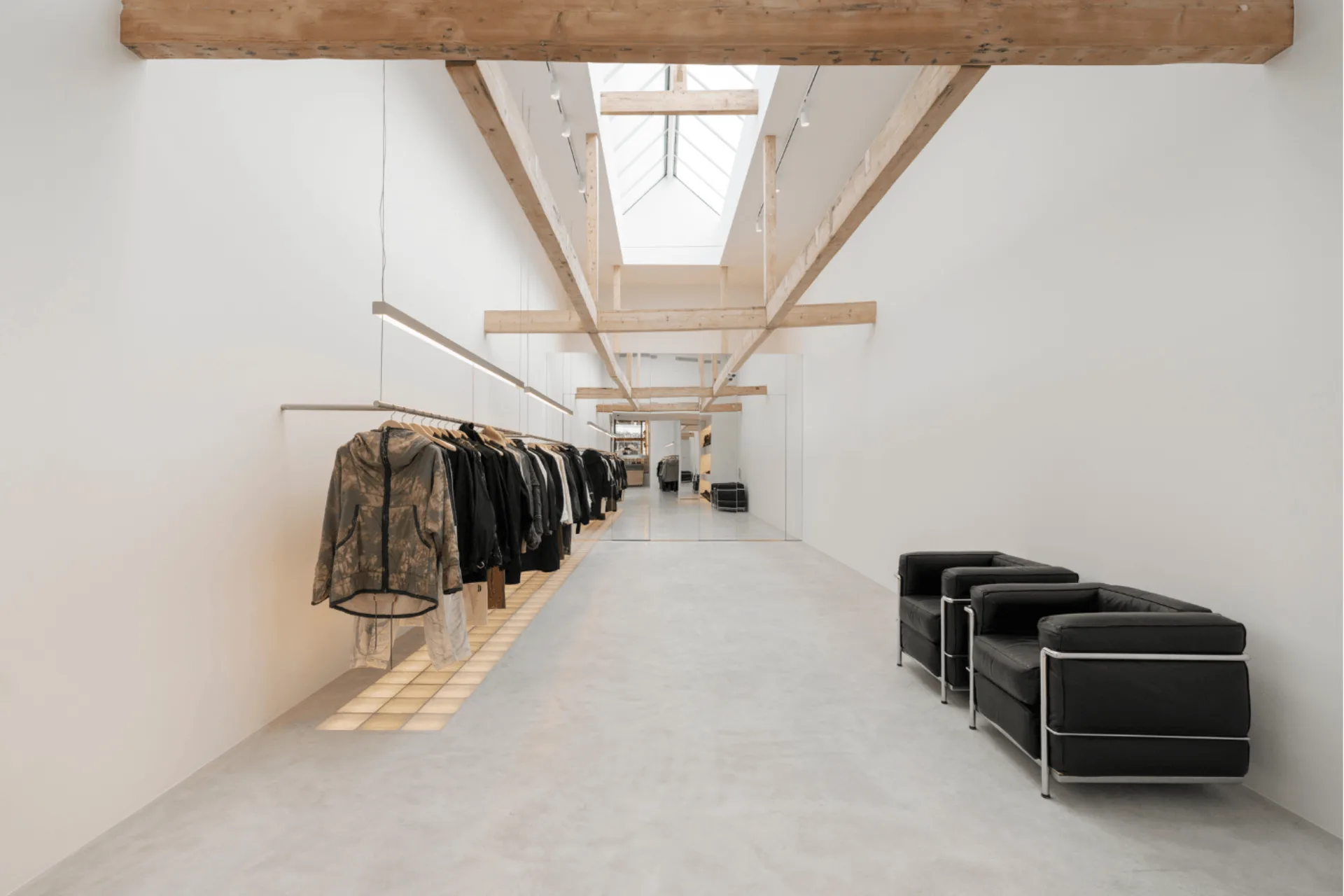
The Amsterdam concept store uses a light grey finish beneath an interior with substantial light from above. That creates a different starting point from a room with windows on only one side.
The Harmelen farmhouse shows a warmer beige-grey direction across the floor and kitchen island. Look especially at where the materials meet. Use these projects to identify what appeals to you, then make the final choice around your own room and light.
Prepare a useful colour conversation.
Collect a small number of references and say what you like about each: the shade, quiet marks or visible grain. Bring photographs of the room in daylight and normal artificial light, actual samples of settled materials and the intended application.
Include practical wishes about use and cleaning. We can discuss the possibilities and which samples would help make the decision. The cost page explains the financial side of preparing a proposal.
Frequently asked questions.
Which colour suits a timber kitchen?
Consider the timber's undertone, the worktop and the light together. Compare samples against the real kitchen material rather than selecting from a photograph of a similar wood.
Can the floor and wall have the same colour?
Discuss the available combination within the system. Even corresponding colours can appear different as light meets horizontal and vertical surfaces differently.
Can you reproduce an exact paint or RAL colour?
Bring the reference to discuss possibilities. Evaluate the intended texture and protection as well. A code alone is not enough to promise an exact visual match between paint and microcement.
Is a light or dark floor easier to keep clean?
No colour hides every kind of dirt or use. Texture, protection, light and activity all matter. Choose the complete appearance and discuss its care alongside it.
Will the result look exactly like the sample?
The sample defines the direction, not a pattern copied exactly. A large hand-applied area develops its own marks. Agree the expected degree of variation beforehand.

A surface that belongs to the room.
Tell us what is already there and what you have in mind. We can look at colour, light and texture together before the first layer is applied.